22 September 2026 · 5 min read
Bouquet Color Combinations: Beautiful Palettes and How to Choose Them
Choose five usable bouquet palettes with visual swatches, real Baqah examples, and practical advice on contrast, proportions, and personal taste.
A beautiful bouquet does not need every beautiful color. It needs a clear relationship between the colors you notice first, the ones that support them, and the spaces between flowers. Start with the recipient's favorite shade, then decide whether you want a quiet arrangement or an energetic one. The five combinations below use existing Baqah bouquets, so you can compare an actual digital design instead of imagining an abstract color wheel.
Read the palette before choosing flowers
Hue means the color family; lightness tells you how pale or dark it is; saturation describes its intensity. A pale lavender and a deep violet share a family but behave differently beside cream. Monochromatic schemes vary one hue, analogous schemes use neighboring hues, and complementary schemes use opposites on the traditional color wheel. These are design tools, not rules about which feelings a recipient must have. See Iowa State's floral design guide.
For your first attempt, choose one leading color, one supporting color, and a quieter bridge such as ivory or foliage. Judge their visible area rather than counting stems: one sunflower can occupy more space than several small blossoms. Our practical starting point is roughly half the visible flowers in the leading color, with the remainder shared unequally. This is a suggestion, not a florist's formula.
Five palettes you can actually use
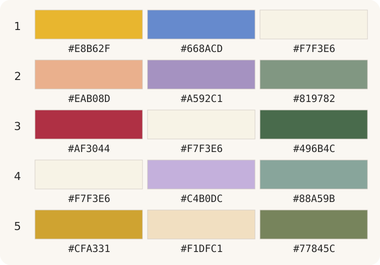
Original palette illustration. Rows 1–5 match the examples below. Hex codes are suggested design colors, not measurements sampled from flowers or promises about screen color.
1. Gold, blue, and ivory
Sunflowers & Blue Delphinium puts broad golden faces beside smaller blue flowers and white lisianthus. Use gold as the main event, repeat blue around the edges, and let ivory interrupt dense areas. This is a warm–cool contrast, not an exact complementary pair: yellow's traditional opposite is violet, while orange's is blue. Choose it for an upbeat congratulations message. If the combination feels loud, reduce the blue area before adding another color.
2. Peach, lavender, and sage
Peach Roses & Lavender offers a gentler contrast. Peach supplies warmth; lavender introduces a cooler accent; subdued green prevents the two from seeming disconnected. Keep the peach blooms visually dominant and repeat lavender in small groups. This works for a personal thank-you when bright red would feel too emphatic. Avoid adding strong yellow merely to make it cheerful: that changes the balance rather than simply improving it.
3. Red, ivory, and deep green
Gypsophila & Red Roses shows why flower size matters as much as hue. Large red roses anchor the design, while tiny white flowers create breathing room. Green supports the silhouette. For a romantic message, let red remain unmistakably dominant; too much dense white can make the roses look like scattered dots. A short, specific note will communicate more than relying on an assumed universal meaning for red.
4. Ivory, lavender, and eucalyptus green
White Lilies & Lavender Roses uses pale colors with different forms: open lilies, rounded roses, and smaller white accents. Lavender gives the eye somewhere to settle without turning the design into a bright contrast study. On a pale background, the green outline helps separate the bouquet from the page. Consider it for a thoughtful greeting, but check the recipient's customs before choosing white flowers for a sensitive occasion.
5. Gold, cream, and olive green
Golden Chrysanthemums & Cream Roses keeps the flower colors close in warmth. Cream softens gold without introducing a competing bright hue. Choose this for a warm birthday or appreciation note; use the darker foliage to frame the lighter blooms. If everything appears flat, increase the difference between light and dark rather than adding purple automatically. A harmonious bouquet still needs readable shapes.
Make the final choice in three passes
First, view the whole bouquet small, as the recipient might see it in a message. Can you tell which color leads? Next, enlarge it and check whether filler hides the main flowers. Finally, compare it with the card background and text. A rich bouquet does not need equally colorful lettering.
The University of Georgia notes that contrasting colors often work better with one dominant than in equal amounts; our examples apply that principle to bouquets, rather than treating landscape guidance as a bouquet recipe. Read the color theory explanation.
Baqah offers finished digital illustrations, not a stem-by-stem florist order. Choose the closest existing composition and personalize the message. For physical flowers, show a florist the palette and ask what is available; illustrated blue or lavender shades do not establish a natural species or exact cultivar. Read how blue roses are made, explore the visual flower guide, or choose words from flower captions.
Frequently asked questions
How many colors should a bouquet have?
Two main flower colors plus a quiet supporting shade are an easy starting point. More can work when one remains dominant and repeated colors connect the arrangement.
Are blue and yellow complementary colors?
Not on the traditional red–yellow–blue wheel used here. They provide warm–cool contrast; yellow–violet and blue–orange are the complementary pairs.
Can an all-white bouquet still have contrast?
Yes. Compare flower sizes, petal texture, shadows, and foliage. White lilies and tiny white filler can remain distinct without introducing a bright second color.
Should I choose by symbolism or personal taste?
Start with taste and the occasion. Use the flower meaning guide as context, not a universal code, and explain your choice in the message.